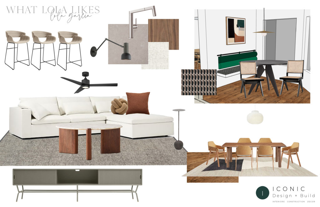
In September 2020, we moved into a 1969 mid-century-style ranch in Phoenix, Arizona. The moment I walked into this home, I was immediately drawn to its split floorplan, mountain view, and large windows that carried in the most beautiful natural light. This home was more than double in size of our previous home, yet very outdated, and I knew it would need some serious love to fit my modern aesthetic. I saw the potential in its original state and now, I am so happy I decided to purchase this home. Everything about it makes me happy.
As you know, I have worked with a few different designers in my old home but felt this particular house needed a new direction. A unique tactic and more importantly, a desire to branch away from “the norm” that I often saw on social media. I found Kaitlyn Wolfe of Iconic Design & Build through Instagram and she was everything I was looking for in this new approach. Every design she creates is different from the next yet stays true to her style and aesthetic. She and her entire team are a joy to work with.
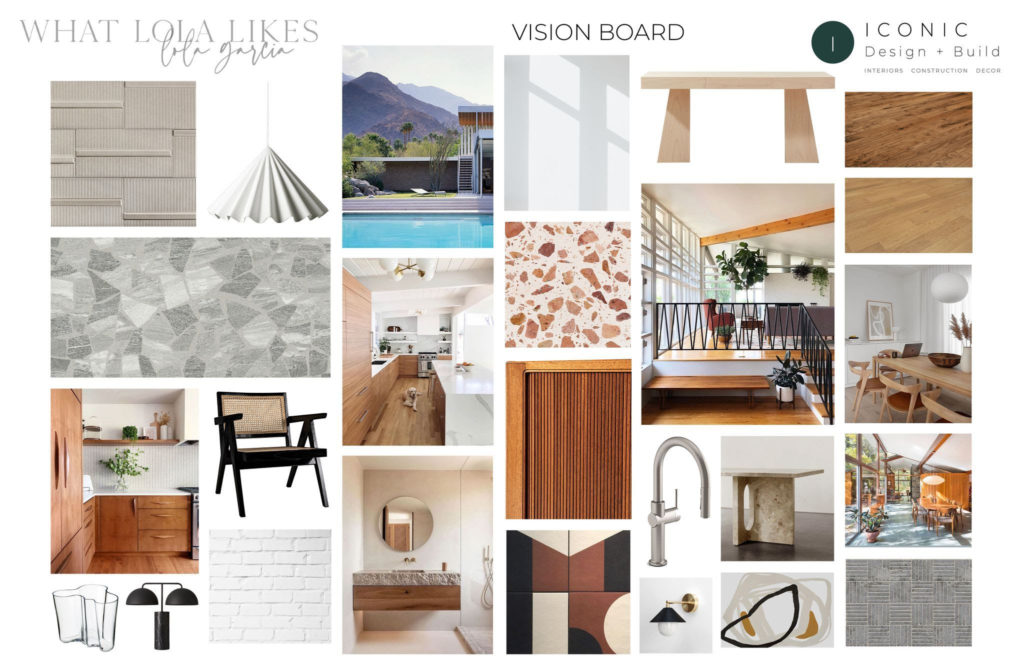
We started by looking at inspiration and color schemes. Kaitlyn and her team put together an overall style for the home. We decided we would begin there and work our way room by room as time progressed and projects developed. The kitchen would be the hub of the home and where we would start. We wanted to modernize many details yet to keep costs low, she worked with existing materials such as the layout, fluted cabinet doors, skylights, and appliance placement.
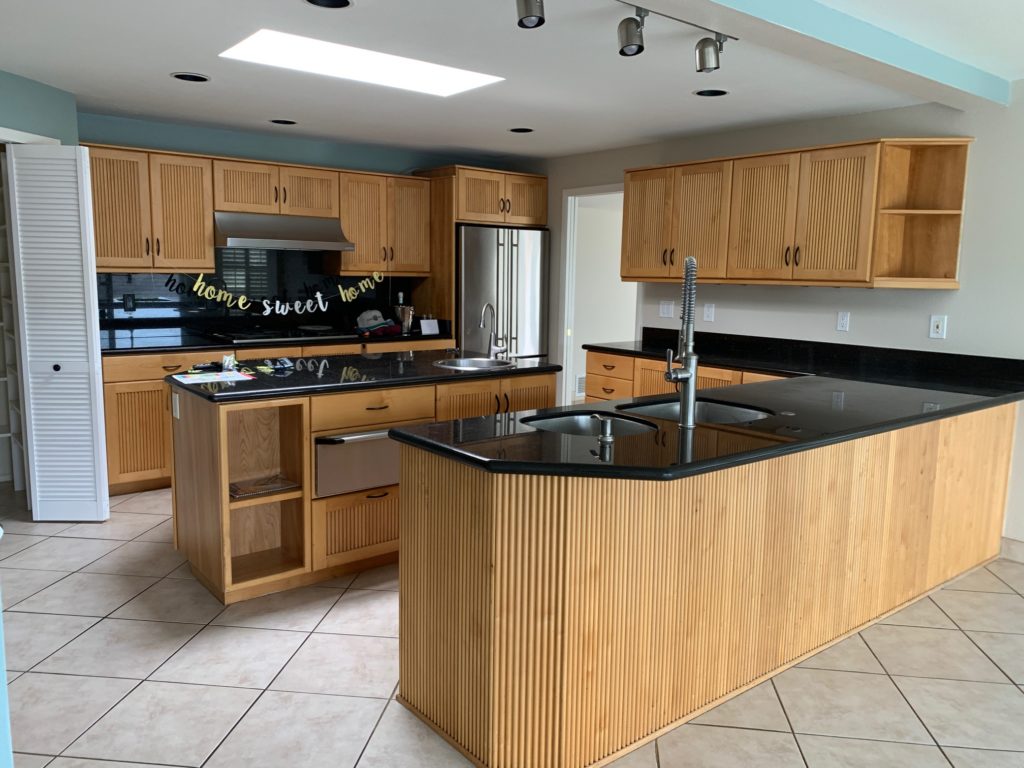
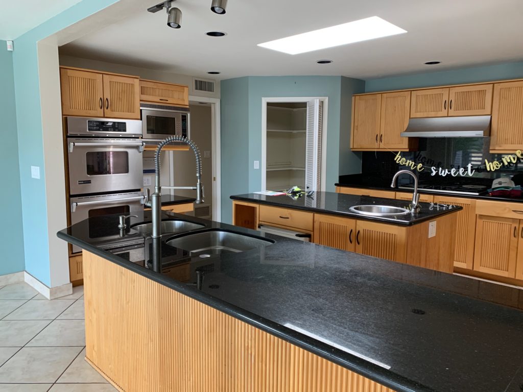
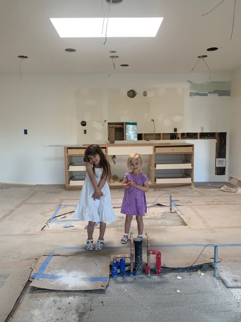
The Beginning-Before the Kitchen Remodel
Can you believe this is what the space used to look like? We started the renovation process fairly quickly. We temporarily moved into this home for a few short weeks, then moved to an Airbnb. If I were to do it again, I’d suggest saving the back and forth and renovating the floors and painting before moving in. I know that isn’t always feasible financially or sensible, but it may save a little hassle in-between if planning ahead is an option.
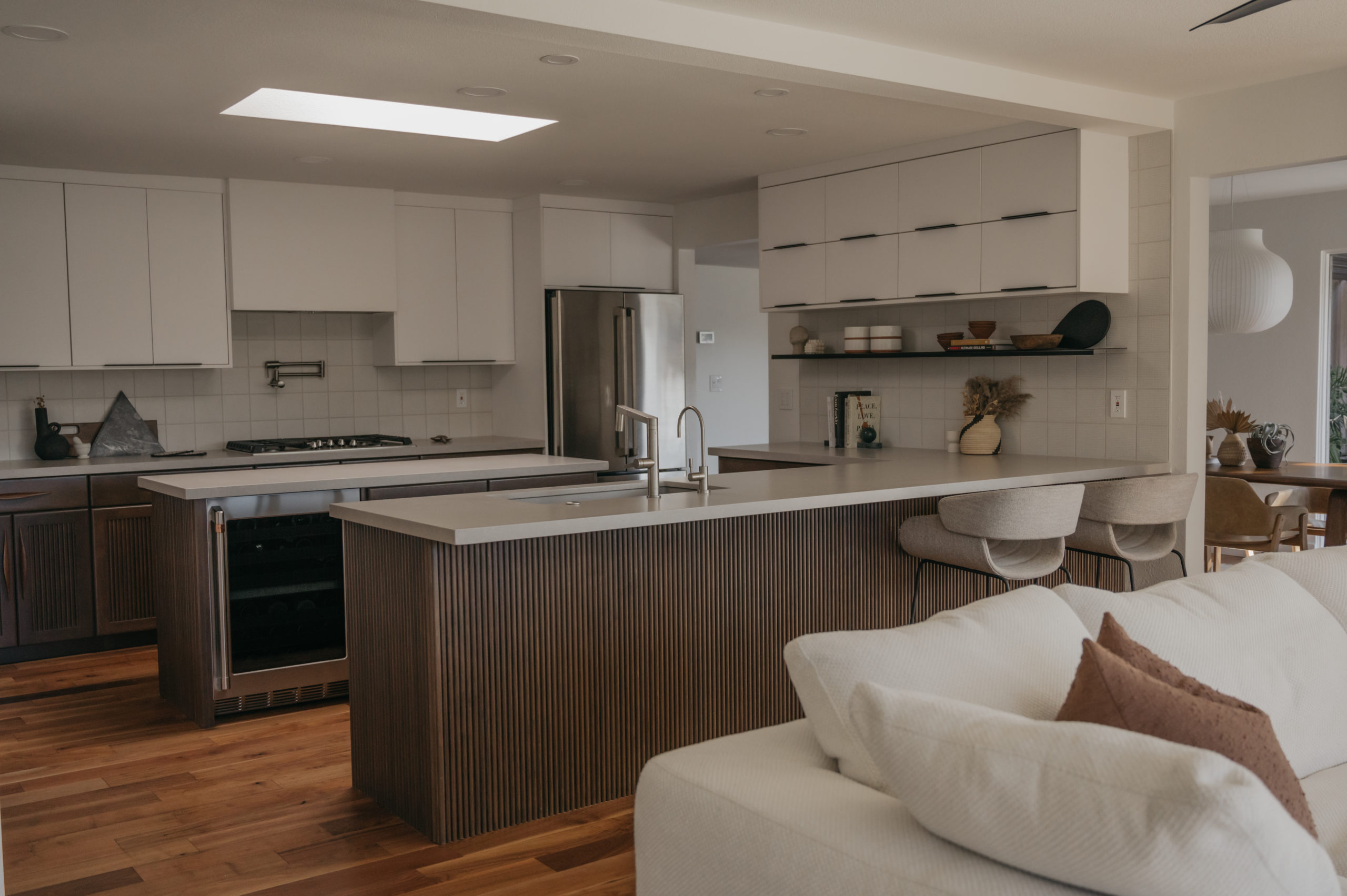
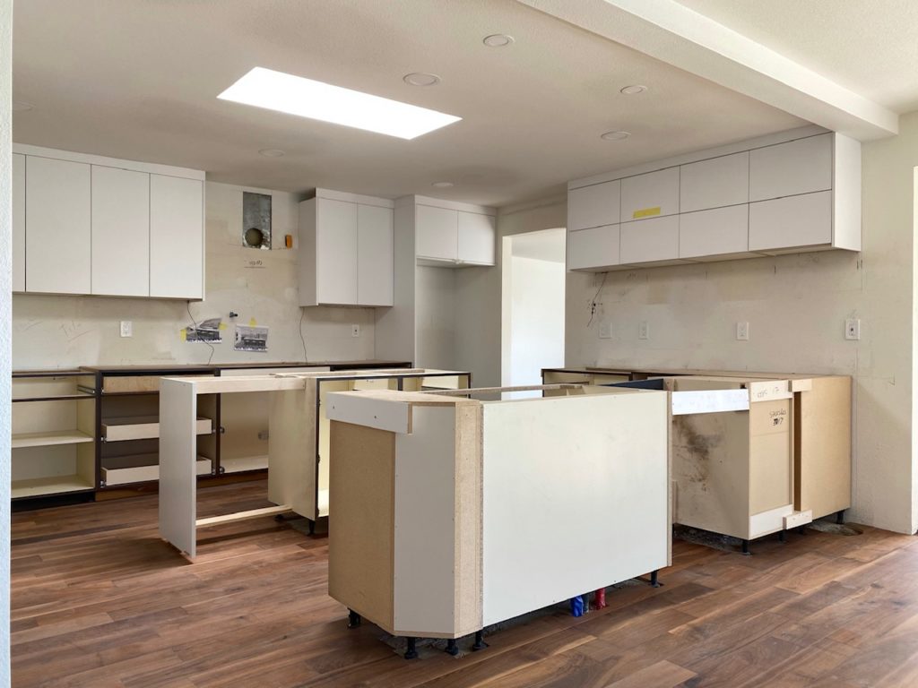
The floors went from an off-white tile to a beautiful Midcentury-Modern staple – walnut, matching the soon-to-be kitchen cabinetry. Originally, the walls were beige with pops of blue, now they are Chantilly Lace. This change made the entire space bright, white, and larger in appearance. In this phase, we also demoed the walk-in pantry, closed off a doorway, and opened two more doorways to the adjacent spaces. This allowed the once intimate room to be fully functional and maximized to its full potential.
The Middle-During the Kitchen Remodel
The next phase of the kitchen remodel came a few months later than expected as personal reasons transpired and it took some time to get back on everyone’s schedule. We moved out for two months and I couldn’t wait to drive to the house as often as possible to watch the process. It was equal parts addicting and fun to see the changes and to share on social media.
Now, the BIG reveal that you have all been waiting for 😉 Kidding…I do appreciate the patience and support on this post nonetheless. It is still so crazy to see the difference in the before/after even after living in it for almost a year now. I couldn’t be happier with how it turned out. Kaitlyn and her team are pure MAGIC!
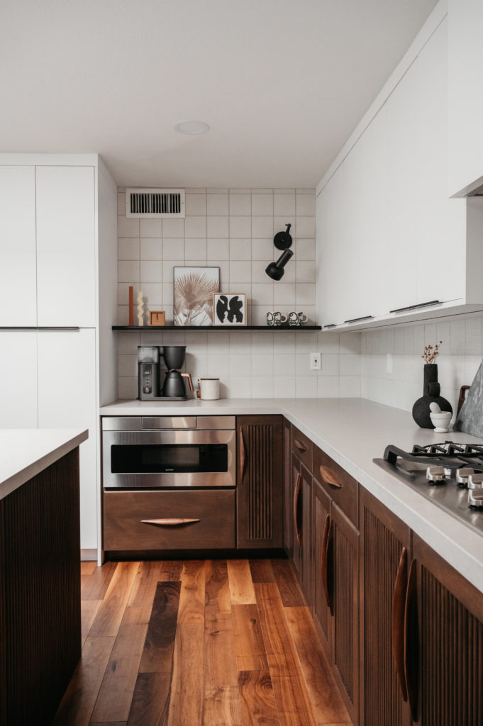
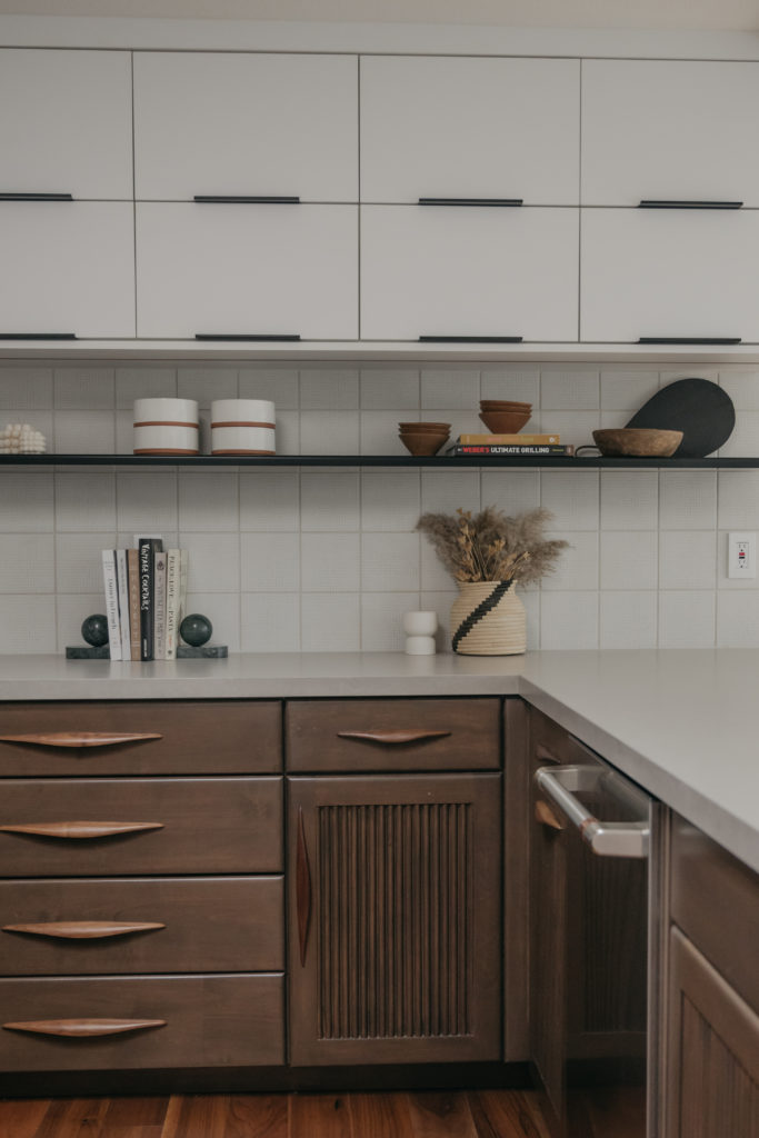
“To soften the contrast, we chose a light grey, matte-finished quartz countertop by Arizona Tile and a square backsplash tile by Craftsman Court. In keeping with the classic mid-century modern finishes, we chose stainless steel plumbing fixtures and appliances by Blanco and GE Café. We also included steel floating shelves and LED lighting to display kitchenware and art.”
Kaitlyn Wolfe of Iconic Design & Build
The End-The Finished Kitchen
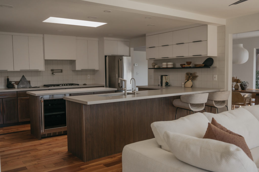
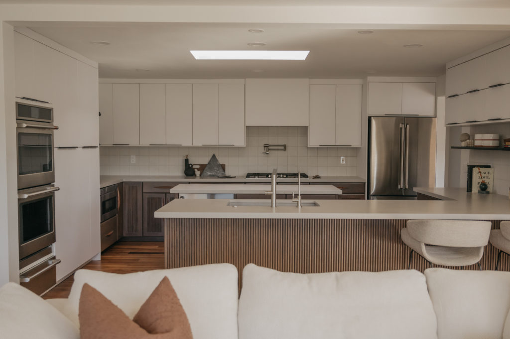
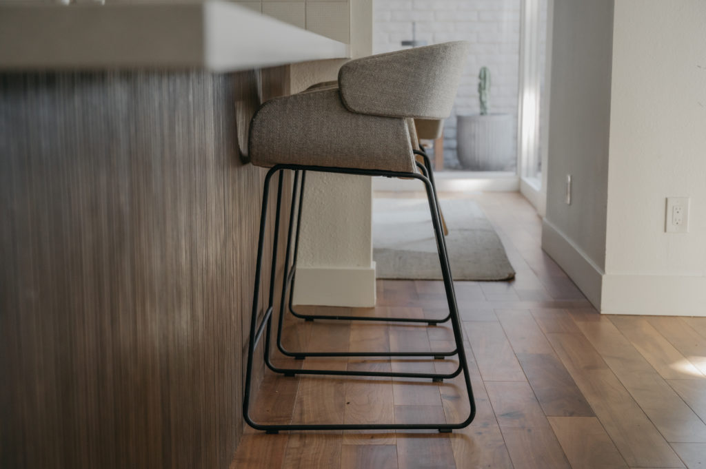
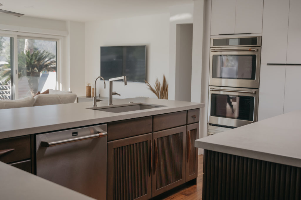
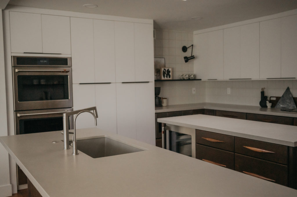
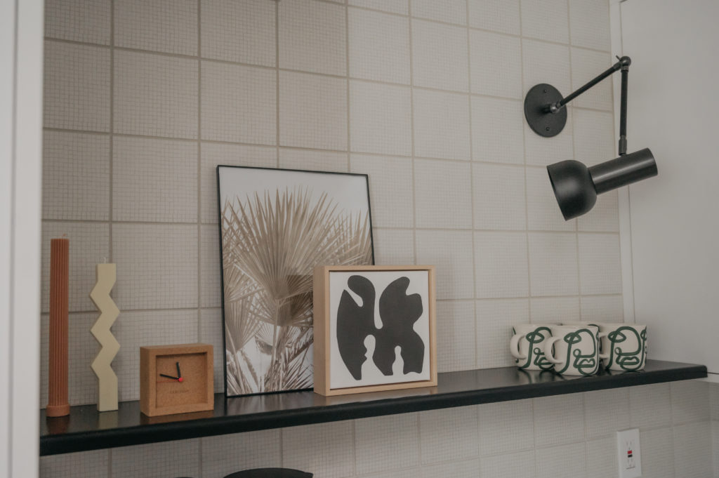
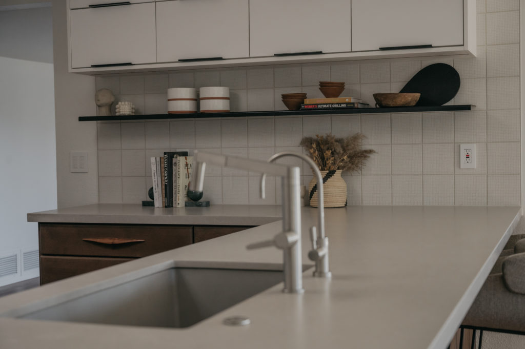
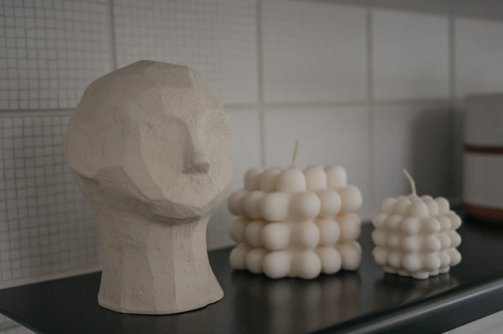
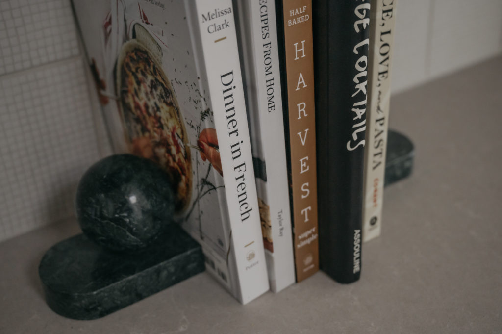
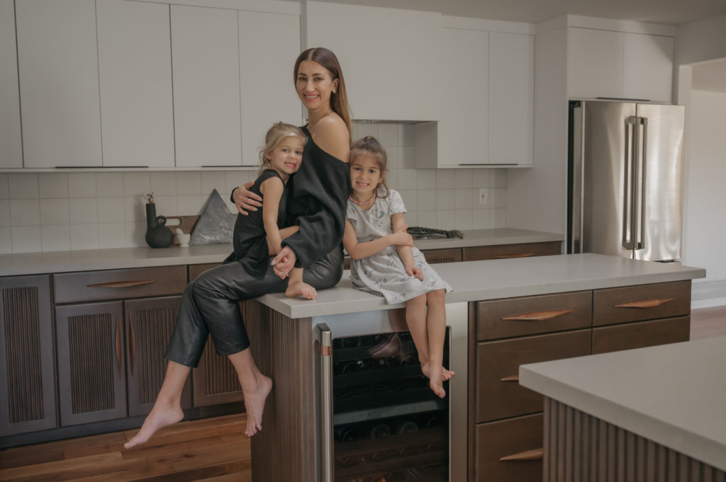
photos by Jennica Maes, Amaes Photography
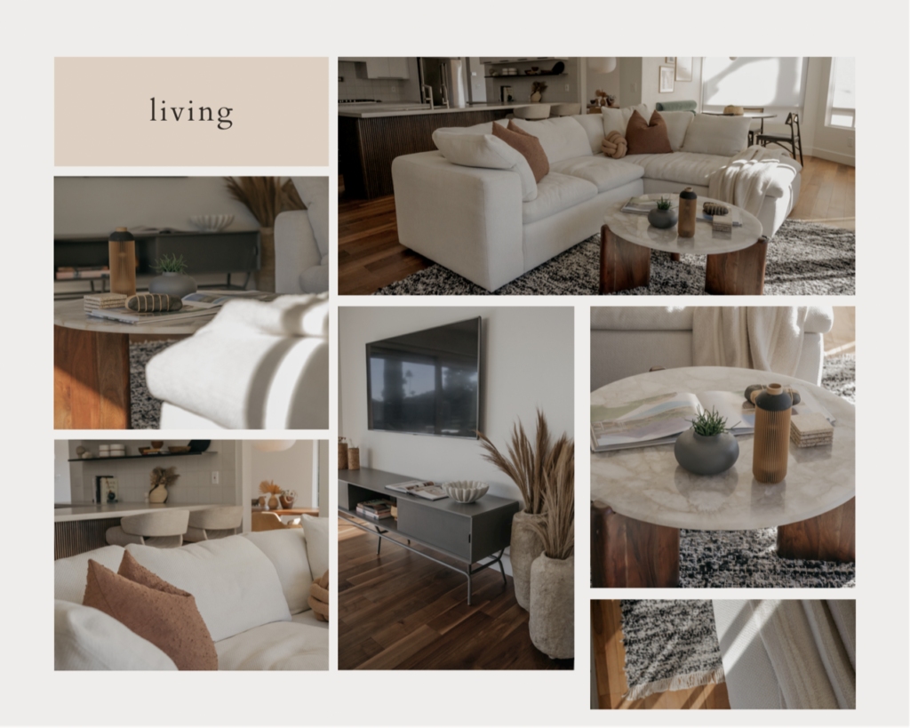
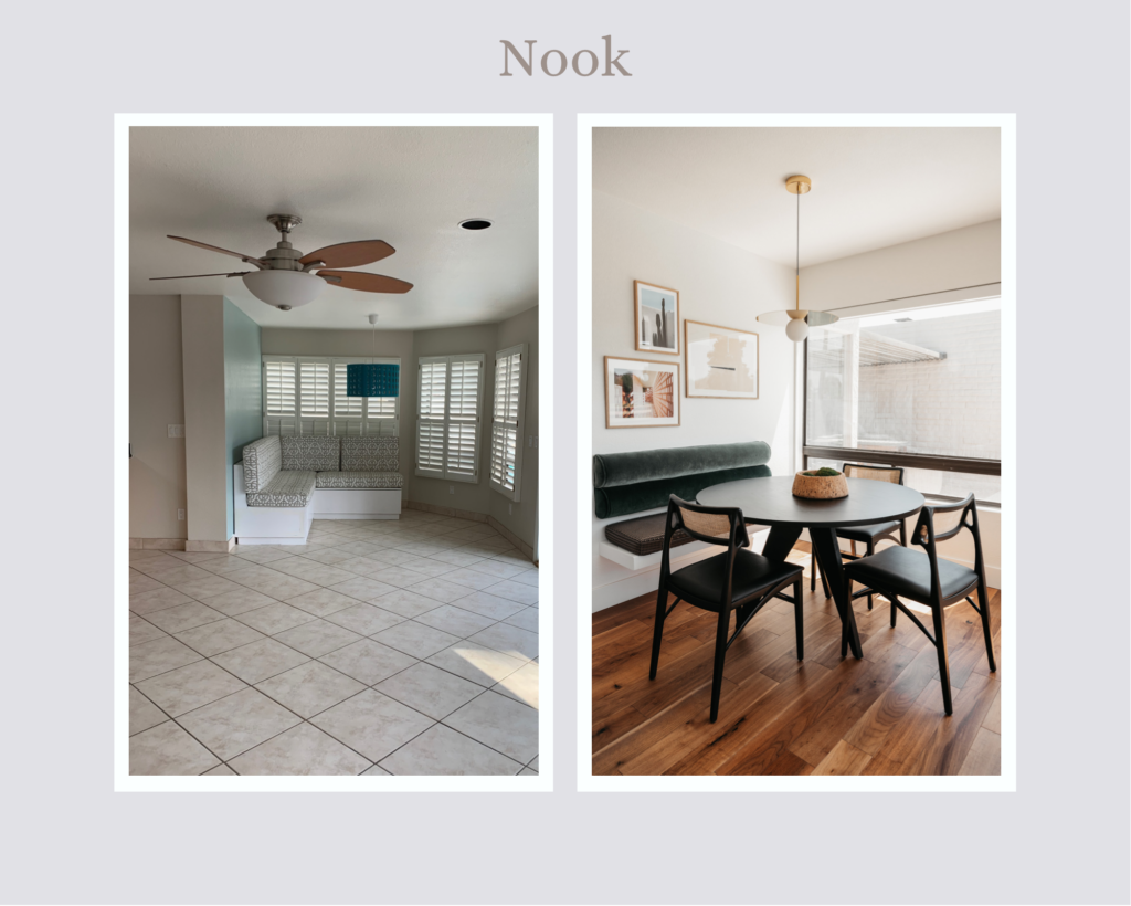
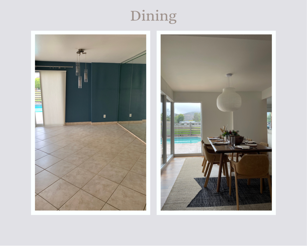
Along with the kitchen remodel, Kaitlyn and her team transformed the kitchen nook into a beautiful Palm Springs meets coffee shop vibe and a dining room that has made my entertaining, neutral, and Scandinavian-inspired dreams come true. I love the indoor/outdoor feel of the space and how they both just flow with the kitchen/living designs.
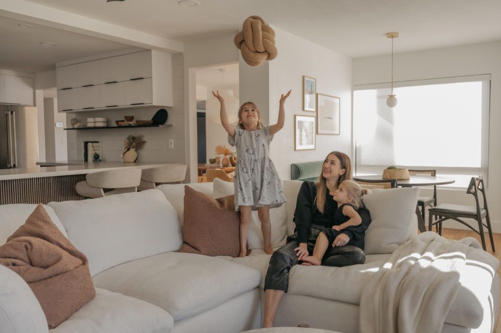
“To make this a truly family-friendly home, we designed the living room for movie nights. The custom sectional has a white boucle, performance-fabric and was designed to either face the TV or look out at the golf course and mountains.”
Kaitlyn Wolfe of Iconic Design & Build
KITCHEN DETAILS & LOCAL
- Design– Iconic Design & Build
- Demo– Removal Tech
- Doorway closing and openings plus drywall – House Doctors
- Floors– Urban Floor, Ultra Matte Walnut
- Wall Paint– Chantilly Lace by Benjamin Moore
- Cabinets – New Age Cabinetry and Coatings
- Appliances– Café Appliances (Double oven, Gas Cooktop, Dishwasher, Wine Fridge, Warming Drawer, Refrigerator, Wifi Coffee Maker)
- Other appliances– Sharp Microwave Drawer Oven, Pot Filler
- Electrical– Nogi Electric
- Backsplash – Craftsman Court Ceramics (Porto White 6×6 Studios Collection)
- Steel Shelving and Nook Bench– Pierce Designs
- Counters – Arizona Tile (Della Terra Quartz in Ivory White Honed)
- Sink/Faucet – Blanco (Panera Kitchen Faucet, Diamond Super Single Dual Deck Sink and Grid)
- Bottom Cabinet Pulls– Manzoni Cape Pull Walnut
- Top Cabinet Pulls– Top Knobs Europa Tab Pull
- Baseboards– 5 ½ Eased Edge Craftsman Baseboard
FURNITURE LINKS
- Living Couch– Custom made by Haven Furniture
- Living Coffee Table – CB2
- Living Rug– Loloi Rugs
- Nook Table – Interior Icons
- Nook Chairs – France and Son
- Nook Light – Lightology
- Dining Table – Moe’s Home Collection
- Dining Chairs – 2Modern
- Dining Light– YLighting
- Dining Rug – Lulu and Georgia
- TV Console – Bludot
- Kitchen Bar Stools – Bludot
xoxo, Lola
